Viz Buzz is a live data visualization competition hosted by , Director of Analytics for the .
Participants are given a publicly available visualization along with the underlying dataset and have 40 minutes to recreate the graphic as accurately as possible.
Submissions are evaluated based on:
- The host’s rankings
- Live Discord viewer voting
- An automated image comparison tool
(Image Comparison Tool used in competition)
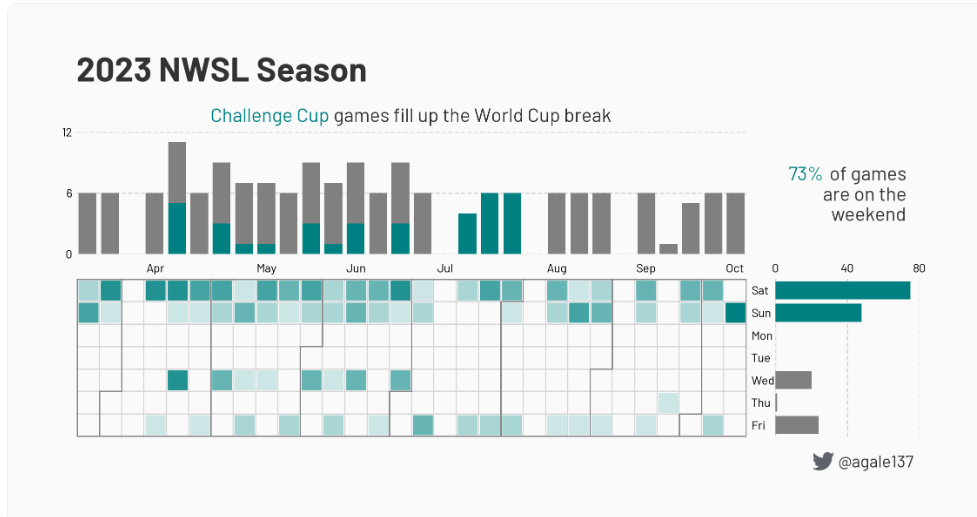
The goal was to replicate the following combined visualization summarizing statistics from the 2023 NWSL season:
I initially began building the recreation in R, intending to use ggplot2 for precise control over layout and layering. However, after encountering technical issues that slowed progress in R,
I made a strategic decision to pivot mid-competition to Tableau. At the time, I was more familiar with Tableau and felt I could put together a winning submission in Tableau with the time constraints.
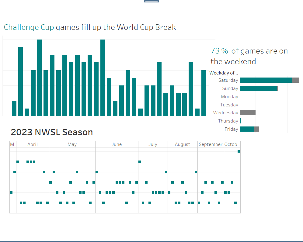
I won all 3 categories of voting and achieved a similarity score of 82.6% using the automated image comparison tool.