A beautiful, customizable layered gradient peak component for React and Next.js. Perfect for hero sections, backgrounds, and visual accents.
npm install peaked-gradientyarn add peaked-gradientpnpm add peaked-gradientimport { PeakedGradient } from 'peaked-gradient'
function MyComponent() {
return (
<div style={{ width: '100%', height: '400px' }}>
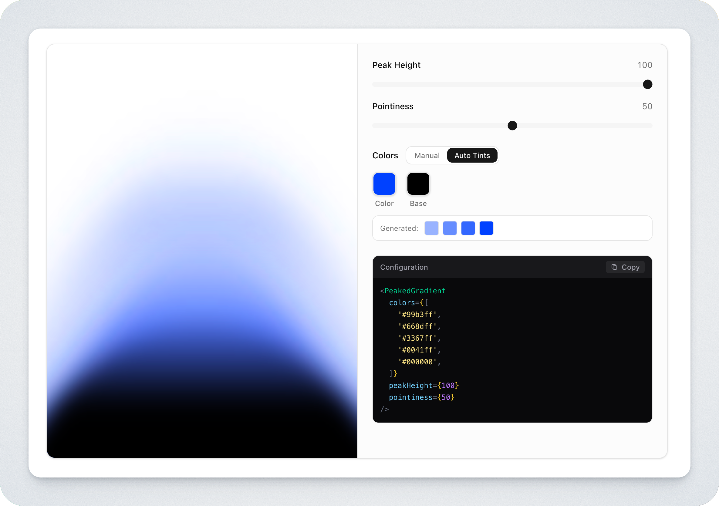
<PeakedGradient
colors={[
'#B6C9FF',
'#8AA8FF',
'#285fff',
'#0041ff',
'#000000',
]}
peakHeight={100}
pointiness={50}
blur={50}
/>
</div>
)
}The component fills its parent container (100% width and height), so wrap it in a sized container.
| Prop | Type | Default | Description |
|---|---|---|---|
colors |
[string, string, string, string, string] |
Required | 5 hex colors for the gradient layers (lightest to darkest) |
peakHeight |
number |
100 |
Peak height (0-100). Controls how tall the peak rises. |
pointiness |
number |
50 |
Sharpness of the peak (0-100). Higher = sharper point. |
blur |
number |
50 |
Blur amount (0-100). 0 = no blur, 50 = default, 100 = double blur. |
className |
string |
- | Optional CSS class |
style |
CSSProperties |
- | Optional inline styles |
The package includes TypeScript definitions:
import { PeakedGradient, type PeakedGradientProps, type ColorTuple } from 'peaked-gradient'

const colors: ColorTuple = ['#B6C9FF', '#8AA8FF', '#285fff', '#0041ff', '#000000']- Original Figma tutorial by @AliGrids
- React component by @mutahharmk
MIT