A Flutter package for interactive image zooming. Two widgets — one for full-image gesture zoom, one for a draggable in-place magnifier tile. Zero dependencies beyond Flutter itself.
| Widget | What it does |
|---|---|
ZoomImage |
Full image zoom — scroll, pinch, pan, double-tap, on-screen controls |
TileZoom |
Draggable magnifier tile — zooms a region in-place at max pixel quality |
dependencies:
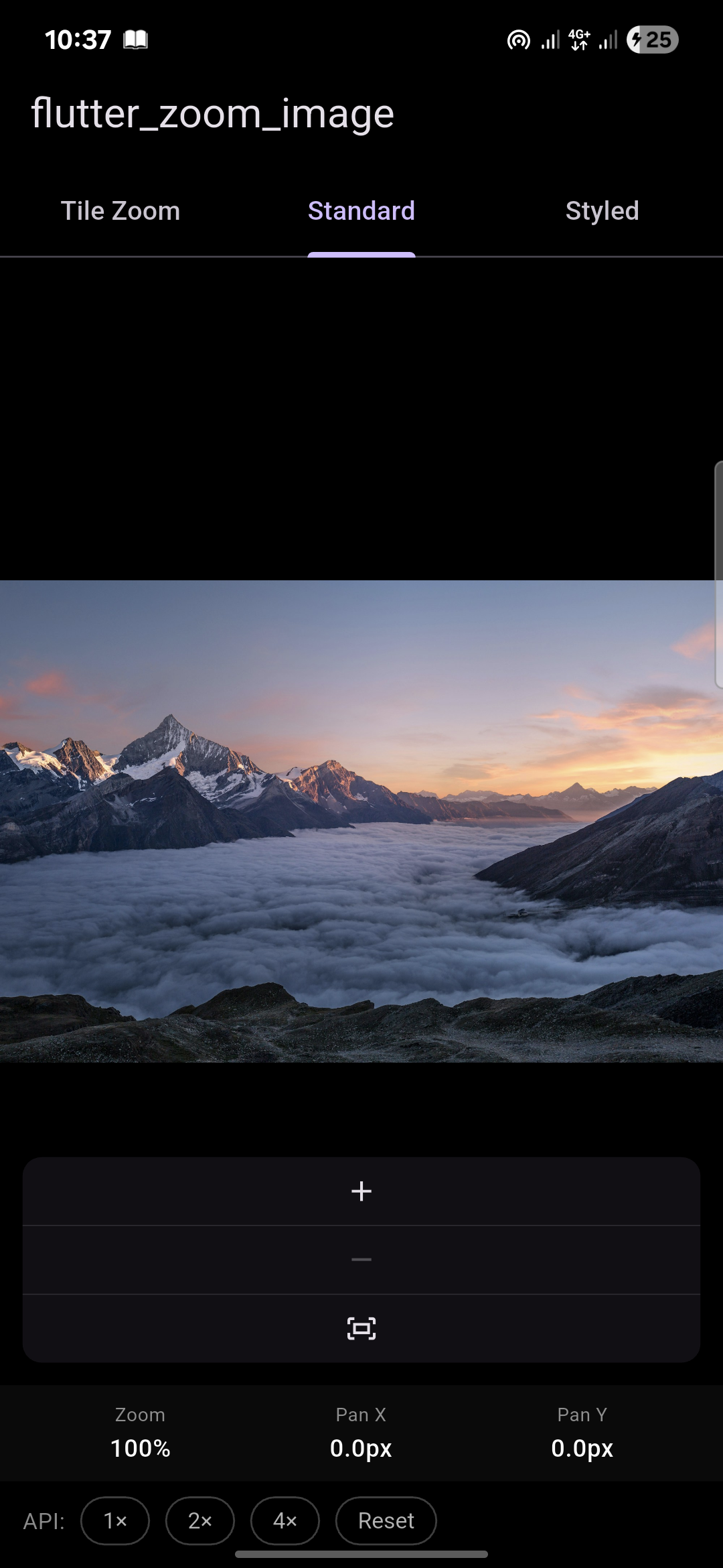
flutter_zoom_image: ^1.0.0import 'package:flutter_zoom_image/flutter_zoom_image.dart';Full interactive zoom for any image. Scroll, pinch, pan and double-tap all work out of the box. An on-screen +/−/reset strip and a zoom % badge are included and fully optional.
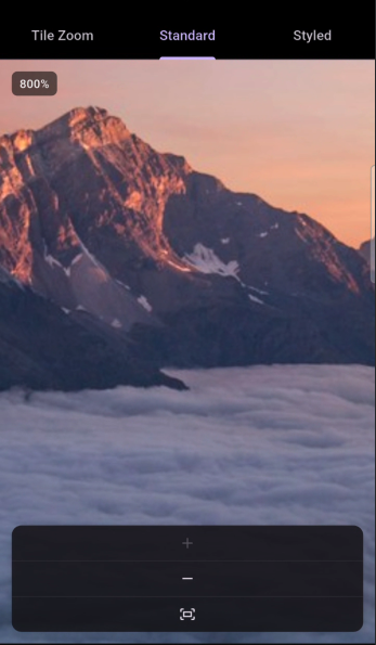
ZoomImage(
  image: const NetworkImage('https://example.com/photo.jpg'),
)ZoomImage(
image: const AssetImage('assets/images/photo.jpg'),
)ZoomImage(
image: const NetworkImage('https://example.com/photo.jpg'),
minZoom: 1.0,
maxZoom: 8.0,
doubleTapZoom: 3.0,
showControls: true,
showZoomBadge: true,
decoration: ZoomImageDecoration(
backgroundColor: Colors.black,
borderRadius: BorderRadius.circular(16),
border: Border.all(color: Colors.white12),
boxShadow: [BoxShadow(blurRadius: 24, color: Colors.black45)],
),
controlsStyle: ZoomImageControlsStyle(
alignment: Alignment.bottomRight,
buttonSize: 40,
backgroundColor: Colors.black87,
iconColor: Colors.white,
zoomStep: 0.5,
),
onZoomChanged: (zoom) => print('zoom: $zoom'),
onPanChanged: (offset) => print('pan: $offset'),
)final controller = ZoomImageController(
minZoom: 1.0,
maxZoom: 8.0,
);
ZoomImage(
image: const NetworkImage('https://...'),
controller: controller,
)
// Control from anywhere in your code
controller.zoomTo(3.0);
controller.reset();
controller.fit();
controller.panTo(Offset(500, 300), widgetSize);
controller.setZoomRange(min: 0.5, max: 10.0);
// Read current state
print(controller.zoom);
print(controller.offset);| Property | Type | Default | Description |
|---|---|---|---|
image |
ImageProvider |
required | Network, Asset, Memory or File |
controller |
ZoomImageController? |
auto | External controller for programmatic access |
minZoom |
double |
1.0 |
Minimum zoom level |
maxZoom |
double |
5.0 |
Maximum zoom level |
initialZoom |
double |
1.0 |
Starting zoom level |
doubleTapZoom |
double |
2.5 |
Zoom level snapped to on double-tap |
scrollSensitivity |
double |
0.001 |
Mouse wheel zoom speed |
fit |
BoxFit |
contain |
How the image fits its bounds |
decoration |
ZoomImageDecoration |
black bg | Background, border, radius, shadow |
showControls |
bool |
true |
Show +/−/reset on-screen strip |
controlsStyle |
ZoomImageControlsStyle |
default | Style the controls strip |
showZoomBadge |
bool |
true |
Zoom % badge in the top-left corner |
clipBehavior |
Clip |
hardEdge |
Clip overflow behavior |
onZoomChanged |
ValueChanged<double>? |
— | Called on every zoom change |
onPanChanged |
ValueChanged<Offset>? |
— | Called on every pan change |
placeholder |
Widget? |
spinner | Shown while image loads |
errorWidget |
Widget? |
broken icon | Shown on load failure |
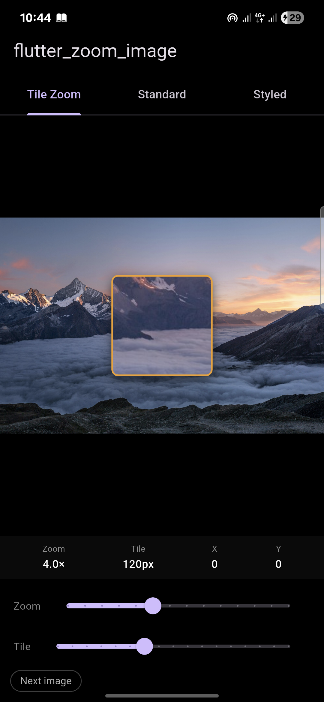
A draggable magnifier tile that sits on top of the image. Drag it anywhere — the region underneath is magnified in-place at the image's maximum pixel quality. The rest of the image stays at its normal display size. No second panel, no separate view.
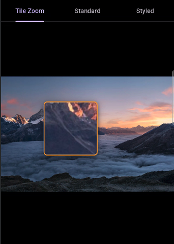
TileZoom(
  image: const NetworkImage('https://example.com/photo.jpg'),
)TileZoom(
image: const NetworkImage('https://example.com/photo.jpg'),
zoomLevel: 4.0,
tileSize: 140.0,
tileBorderColor: Colors.amber,
tileBorderWidth: 2.0,
tileBorderRadius: 10.0,
tileElevation: 8.0,
initialOffset: Offset(100, 200),
clampTileToImage: true,
backgroundColor: Colors.black,
onTilePositionChanged: (offset) => print('tile at: $offset'),
)// Network
TileZoom(image: NetworkImage('https://...'))
// Asset
TileZoom(image: AssetImage('assets/images/photo.jpg'))
// Memory
TileZoom(image: MemoryImage(bytes))
// File
TileZoom(image: FileImage(File('/path/to/photo.jpg')))| Property | Type | Default | Description |
|---|---|---|---|
image |
ImageProvider |
required | Network, Asset, Memory or File |
zoomLevel |
double |
4.0 |
Magnification level inside the tile |
tileSize |
double |
120.0 |
Side length of the square tile in pixels |
tileBorderColor |
Color? |
amber | Color of the tile border ring |
tileBorderWidth |
double |
2.0 |
Width of the tile border |
tileBorderRadius |
double |
6.0 |
Corner radius of the tile |
tileElevation |
double |
6.0 |
Drop shadow elevation |
initialOffset |
Offset? |
center | Where the tile first appears |
clampTileToImage |
bool |
true |
Prevent tile from leaving widget bounds |
fit |
BoxFit |
contain |
How the base image fits its bounds |
backgroundColor |
Color |
Colors.black |
Color shown outside the image |
onTilePositionChanged |
ValueChanged<Offset>? |
— | Called on every drag move |
placeholder |
Widget? |
spinner | Shown while image loads |
errorWidget |
Widget? |
broken icon | Shown on load failure |
Tile position is preserved — changing
zoomLevelortileSizenever resets the tile back to center. Only swapping theimageitself resets it.
ZoomImageDecoration(
  backgroundColor: Colors.grey.shade900,
  borderRadius: BorderRadius.circular(20),
  border: Border.all(color: Colors.white24),
  boxShadow: [
    BoxShadow(
      color: Colors.black54,
      blurRadius: 32,
      offset: Offset(0, 12),
    ),
  ],
)ZoomImageControlsStyle(
alignment: Alignment.bottomLeft,
padding: EdgeInsets.all(16),
buttonSize: 42,
backgroundColor: Colors.black87,
iconColor: Colors.white,
zoomStep: 0.75,
borderRadius: BorderRadius.circular(12),
)| Gesture | Behavior |
|---|---|
| Pinch | Zoom in / out (touch) |
| Scroll wheel | Zoom in / out (desktop / web) |
| Drag / click-drag | Pan the image |
| Double-tap | Toggle between minZoom and doubleTapZoom |
| +/− buttons | Step zoom by zoomStep |
| Reset button | Snap back to minZoom and center |
| Platform | ZoomImage | TileZoom |
|---|---|---|
| Android | ✅ | ✅ |
| iOS | ✅ | ✅ |
| Web | ✅ | ✅ |
| macOS | ✅ | ✅ |
| Windows | ✅ | ✅ |
| Linux | ✅ | ✅ |
Requirements: Flutter >=3.10.0 · Dart >=3.0.0 · Zero external dependencies
MIT © 2025