Showcasing the way the Javascript leaflet library can enhance viewing of earthquake data with interactive plots.
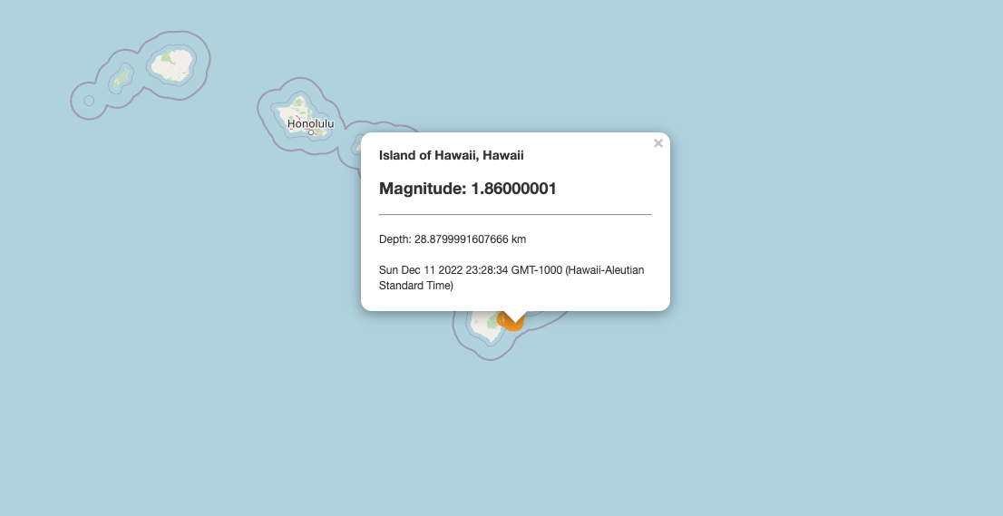
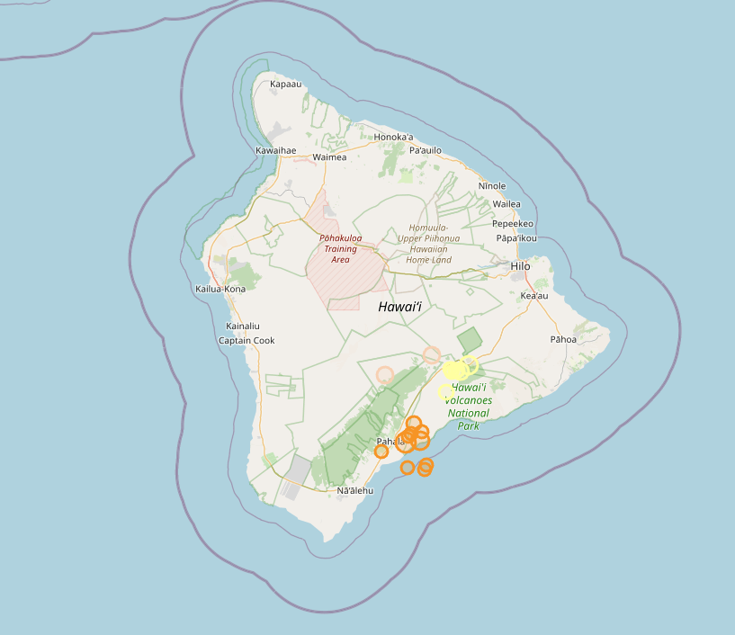
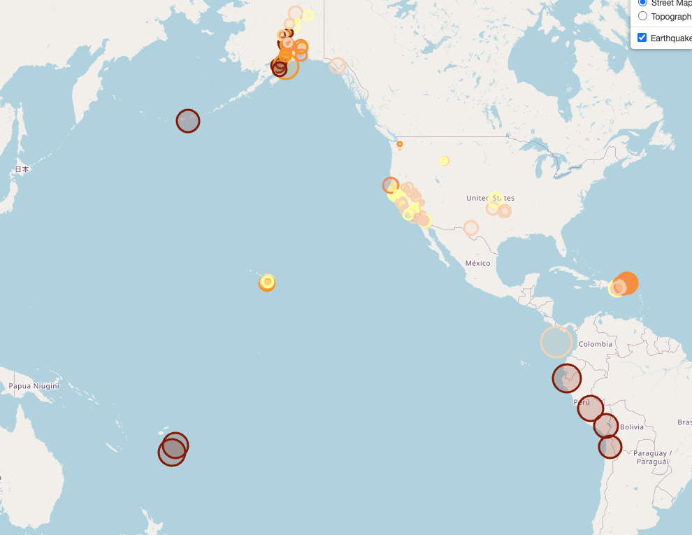
This visualization uses the USGS GeoJSON API to pull all earthquake data collected in a given day. I chose to center our map on Hawai'i where I live. Anecdotally, we've had a lot of seismic activity and I believe this is correlated with the recent eruption of Mauna Loa (which erupted last in 1984).

This map details information by size, color, and pop-up. Larger circles reflect larger magnitude earthquakes while smaller reflect smaller magnitudes. Darker colors represent the deeper quakes while lighter colors represent quakes that happened closer to the surface.
You are also able to click on each sphere to see more details about the quake. Enjoy!