In the administration interface, there is often a need for dynamic modal creation.
To simplify this process, paper-admin uses a wrapper around the standard Bootstrap
Modal class.
const modals = window.paperAdmin.modals;

// Creating an instance of PaperModal popup
const popup = modals.createModal({
    title: "Warning!",
    body: "<h2>Confirm something</h2>\n<p>... or not.</p>",
    modalClass: "paper-modal--warning fade",
    buttons: [
        {
            label: "Cancel",
            buttonClass: "btn-light",
            onClick: function (event, popup) {
                popup.destroy();
            }
        },
        {
            autofocus: true,
            label: "OK",
            buttonClass: "btn-info",
            onClick: function (event, popup) {
                popup.destroy();
            }
        }
    ]
});

// Displaying the modal
popup.show();title:String
The title of the modal.body:String
The content of the modal. Can include HTML.modalClass:String
Additional CSS classes for the modal. Multiple classes can be specified separated by spaces.modalDialogClass:String
Additional CSS classes for the.modal-dialogelement.backdropClass:String
Additional CSS classes for the backdrop element of the modal.closeButton:Boolean
Whether to add a close button to the modal header.buttons:Object[]
Buttons added to the footer of the modal.templates:Object
HTML templates for the modal (templates.modal) and its components (templates.closeButtonandtemplates.button).options:Object
Options for the standardModalclass.onInit:Function
Function called after the modal's DOM elements are created.onDestroy:Function
Function called before the modal's DOM element is destroyed.onClose:Function
Function called when the modal is closed by clicking the close button or pressing theEsckey.
Buttons for the modal are defined using an array of objects. Each object can include the following fields:
label:String
The text of the button.buttonClass:String
Additional CSS classes for the button.autofocus:Boolean
Whether to focus on this button when the modal is shown. Having focus on the button allows the user to trigger the associated action by pressing theEnterkey.onClick:Function(event, popup)
The action associated with clicking the button.
show()
Shows the modal.hide()
Hides the modal. The modal can be shown again by calling theshow()method.destroy()
Destroys the modal. Removes the associated DOM elements. After calling this method, thePaperModalinstance becomes useless.
In addition to the createModal function, which creates a basic PaperModal instance,
the window.paperAdmin.modals object contains functions for creating and displaying
specialized types of modals.
Displays form validation errors.
const modals = window.paperAdmin.modals;

modals.showErrors("Please enter you name");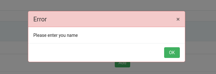
Displays a modal with a preloader.
const modals = window.paperAdmin.modals;

modals.showPreloader();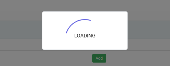
Displays a modal with a preloader for a given promise. When the promise resolves, the preloader modal is automatically hidden.
The function returns a Promise instance that resolves in the same way as the original.
const modals = window.paperAdmin.modals;

const promise = new Promise((resolve, reject) => {
    setTimeout(() => {
        reject();
    }, 1000);
});

modals.showSmartPreloader(promise).then(() => {
    console.log("Done!");
});