This is a simple Unity package that extends the capabilities of the original Button
- Install DOTween
- Import this from Unity Package Manager. You can download and import it from your hard drive, or link to it from github directly.
https://github.com/RenKOFFF/ExtendedButton.git
- You can replace a regular Button with an ExtendedButton without losing serialized fields by calling the "Replace to ExtendedButton" method from the Button context menu
- After adding the Extended Button component, you can use it like a regular button and, since it inherits from Button, you can use all the original methods and fields.
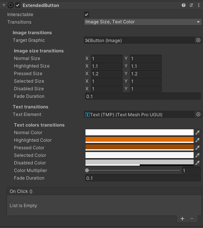
- Use the Transitions field to configure the transformation logic.
- Existing transitions:
- None - no transitions,
- ImageColor,
- ImageSize,
- ImageSprite,
- TextColor,
- TextSize
- Existing transitions:
Transitions can be combined with each other in any desired way
- The Transition field has been replaced with Transitions and now the original field is not used and is hidden from the editor as unnecessary.
- Navigation block is cut out and not used.
- If you use a TextColor transition, the component will automatically assign a white color to the TextMeshPro element. Be careful.